Section 7: Building ML-Powered Property Valuation Dashboards
Learning Objectives
By the end of this section, students will be able to:
- Save and load trained ML models for dashboard deployment
- Create interactive property valuation tools with real-time predictions
- Integrate model outputs with property data, maps, and portfolio analytics
- Build a complete dashboard that combines ML predictions with real estate insights
Introduction
You’ve built gradient boosting models that predict property values accurately. How do you turn these models into tools that investment committees and property managers actually use? Building a dashboard transforms your ML model from a Python script into an interactive application that stakeholders can access and trust.
This section extends the dashboard concepts from Module 1, Section 11 by integrating your trained models into Streamlit. This section assumes you’re familiar with Core Principles and Best Practices for Dashboard Design and basic Streamlit functionality from that earlier section. You’ll learn to save models, load them in dashboards, and combine predictions with property data, maps, and analytics to create a complete valuation tool.
Understanding how components connect helps you build effective dashboards. The flow moves from data sources through processing to user interaction:
Complete Dashboard Example
A complete working Streamlit dashboard demonstrates all the concepts covered in this section. The dashboard includes property search, real-time predictions, comparison tools, portfolio filtering, and map visualization.
Access the complete code: The full dashboard implementation is available at ../assets/code/property_valuation_dashboard.py with installation instructions in ../assets/code/README.md.
The dashboard implements all features discussed in this section: - Model loading with caching for performance - Multiple property search methods (ID, address, browse) - Interactive input forms for new property valuation - Side-by-side property comparison - Portfolio filtering and sorting by value, type, and neighborhood - Interactive map with value-based color coding - Market comparables identification
To run the dashboard locally: 1. Install dependencies: pip install -r requirements.txt 2. Run the app: streamlit run property_valuation_dashboard.py 3. Open your browser to http://localhost:8501
The dashboard uses sample property data for demonstration. Replace the mock model with your trained gradient boosting model to use real predictions.
Dashboard Screenshot:
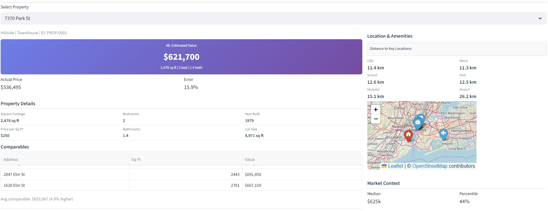
Figure 1: The complete dashboard integrates ML predictions with property details, comparable properties, distance to amenities, an interactive map, and market context metrics.
Saving and Loading ML Models
Before building a dashboard, save your trained models so they can be loaded later without retraining. Think of this like saving a document you’ve written. Once saved, you can open it anytime without rewriting it. This separates model development from dashboard deployment.
Saving Trained Models
After training your gradient boosting model in Section 6, save it to a file. Python’s joblib library handles this efficiently for large models. The process is straightforward: after training completes, save both the model and any preprocessing steps you used.
The key code is minimal:
import joblib
joblib.dump(model, 'property_valuation_model.pkl')
joblib.dump(preprocessing, 'preprocessing.pkl')
Save models after achieving acceptable performance. Include version numbers in filenames (e.g., model_v1.0.pkl) to track different iterations. Document which features the model expects and their order. This documentation prevents errors when loading the model later.
Loading Models in Streamlit
In your Streamlit dashboard, load the saved model when the app starts. Streamlit’s caching feature stores the loaded model in memory, so it loads only once even when users interact with the dashboard multiple times. This improves performance since model loading can take several seconds.
The essential code:
@st.cache_resource
def load_model():
    model = joblib.load('property_valuation_model.pkl')
    preprocessing = joblib.load('preprocessing.pkl')
    return model, preprocessing

model, preprocessing = load_model()
The @st.cache_resource decorator tells Streamlit to load the model once and reuse it. Without this, the model would reload every time a user clicks a button or changes an input, making the dashboard slow.
Handling Preprocessing in Dashboards
Your dashboard must apply the same preprocessing used during training. If you converted property types to numbers, scaled square footage, or filled missing values during model training, you must do the same in the dashboard. The model expects data in the exact format it saw during training.
Create a function that applies all preprocessing steps, then use it before making predictions:
def prepare_features(input_data, preprocessing):
    # Apply same steps: handle missing values, encode categories, scale numbers
    return processed_data

# Use before predictions
processed_input = prepare_features(user_input, preprocessing)
prediction = model.predict(processed_input)
Document your preprocessing steps during model development. This prevents errors when deploying to dashboards where feature order and encoding must match exactly. If your model was trained with “Condo” encoded as 1 and “Single Family” as 2, the dashboard must use the same encoding.
Building the Property Valuation Interface
Now that your model loads correctly, create an interactive interface where users can input property features and receive instant valuations. This transforms your model from a Python script into a tool that investment committees and property managers can use. Start with basic features: property search, input forms, and prediction display.
Property Search and Selection
Users need flexible ways to find properties. Some know property IDs, others remember addresses, and some prefer browsing a list. Your dashboard should support all three approaches: text input for IDs, address search with autocomplete, and dropdown selection for browsing.
Cache your property data when the dashboard loads to improve performance. Use Streamlit’s @st.cache_data decorator for datasets that don’t change during the session. Implement radio buttons to let users choose their preferred search method, then display different input widgets based on their selection.
Once a property is selected, display its details and predicted value. The search interface becomes the entry point for all dashboard features: viewing predictions, comparing properties, and analyzing investment scenarios.
The complete dashboard example implements all three search methods with property preview cards showing key details before users select a property.
Input Forms for Property Features
For properties not in your dataset, create input forms that collect the features your model requires. This allows users to value properties that aren’t in your existing database. Design forms that match how real estate professionals think: group related features together and use appropriate input types for each feature.
Organize inputs into multiple columns for better layout and faster completion. Use number inputs for continuous features like square footage and bedrooms. Use selectboxes or sliders for categorical features like property type and condition. Set reasonable minimum and maximum values to prevent invalid entries.
Collect all user inputs into a DataFrame matching your model’s expected feature format. This ensures the preprocessing pipeline receives data in the correct structure. Add a valuation button that triggers the prediction only when users finish entering all required information, preventing incomplete predictions.
The complete dashboard includes an expandable input form with validation, default values based on market averages, and immediate predictions when users click the valuation button.
Real-Time Prediction Display
Show predictions prominently using large, clear numbers that draw attention. Display the predicted value immediately after users select a property or submit input forms. The workflow is consistent: prepare features using your preprocessing pipeline, run the model prediction, and display the result in a prominent metric card.
Add context around predictions to build trust. Show the model version, prediction confidence if available, comparison to market averages, and the property’s percentile ranking within your portfolio. When actual sale prices exist, display the prediction error to demonstrate model accuracy. This transparency helps stakeholders understand and trust the predictions.
Property Comparison Tool
Enable side-by-side comparison of multiple properties. Investment committees often need to compare acquisition candidates or understand why similar properties have different predicted values. Design comparison views with two or three columns showing properties side-by-side.
Display predicted values prominently, then show key differences: square footage, price per square foot, location factors, and property characteristics. Highlight the dollar difference and percentage difference between properties. Add visualizations showing feature differences that explain value gaps.
Comparison tools reveal pricing patterns and help users understand relative values. For example, comparing two condos in the same building might show that properties on higher floors consistently predict 5-8% higher values. These insights inform acquisition strategies and pricing decisions.
The complete dashboard includes side-by-side property details, price differences, feature comparisons, and price-per-square-foot metrics for up to three properties simultaneously.
Interactive Investment Analysis
Beyond basic valuation, enable users to explore investment scenarios by adjusting controllable property factors. Real estate investors need to evaluate renovation potential and ROI before making acquisition decisions. Focus on factors investors can actually control: property condition through renovations and effective age through modernization.
Create interactive sliders that adjust property condition and effective age, then recalculate predictions in real time. Show the adjusted property value and the gain or loss compared to current condition. This immediate feedback helps investors evaluate whether renovation costs justify the expected value increase.
Provide realistic investment scenarios with cost estimates and ROI calculations. Display potential returns for different renovation strategies: cosmetic updates (5% of property value, 50-150% ROI) for properties in poor condition, full renovations (15% of property value, 30-80% ROI) for fair condition properties, and value-add projects (12% of property value, 40-70% ROI) for properties already in good condition. Calculate net profit by subtracting renovation costs from value gains.
Investment Analysis Screenshot:
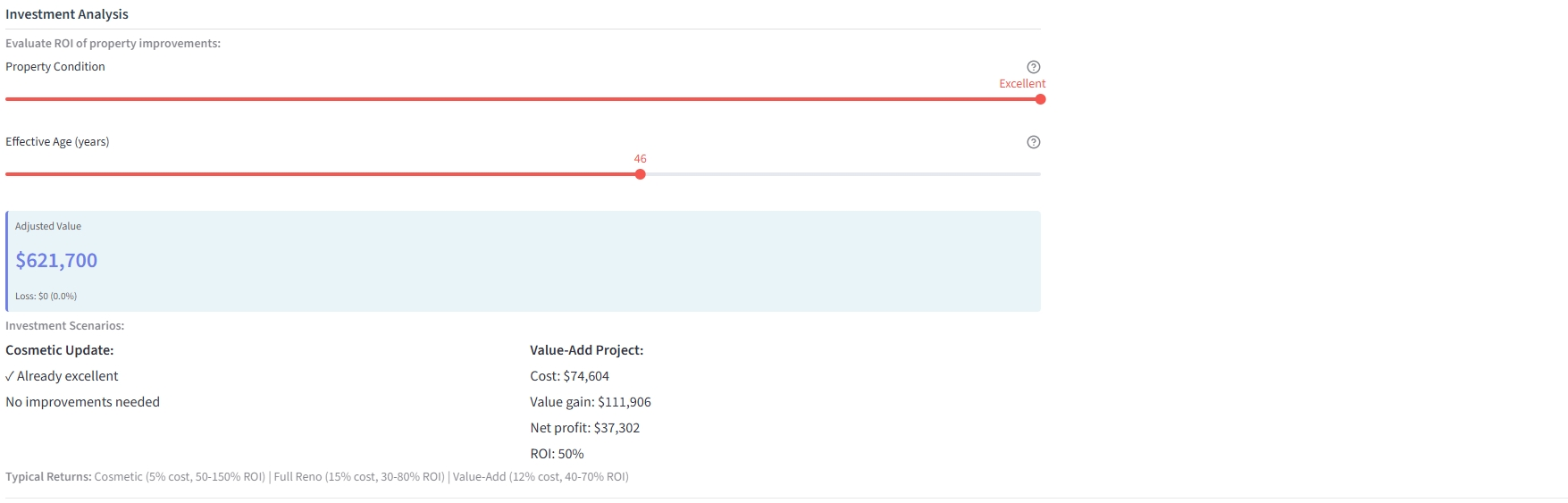
Figure 2: The investment analysis interface allows users to adjust controllable factors like property condition and effective age, then displays realistic renovation scenarios with cost estimates, value gains, net profit, and ROI calculations.
This interactive feature transforms the dashboard from a valuation tool into an investment decision support system. Users can experiment with different improvement strategies and see immediate financial projections, helping them make data-driven acquisition and renovation decisions.
Integrating Predictions with Portfolio Data
Once you have basic property valuation working, enhance the dashboard by combining model predictions with existing property data. This integration makes predictions actionable and provides the context stakeholders need to make decisions. Add property details, market comparables, maps, and filtering capabilities.
Displaying Predictions with Property Details
Show model outputs alongside property information to provide context. Displaying predictions without context reduces trust. Include property basics: square footage, bedrooms, year built, property type, and location. Group related information together using cards or sections that users can quickly scan.
When actual sale prices exist, compare predictions to actuals to demonstrate model accuracy. Show both the absolute error and percentage error. Display a visual indicator (green for accurate, yellow for moderate error, red for large error) that helps users quickly assess prediction quality. This transparency builds confidence and helps users understand model limitations.
Adding Market Comparables
Include similar properties to provide market context. Real estate professionals always look at comparables when valuing properties. Your dashboard should do the same. Find properties with similar characteristics: same property type, similar square footage (within 20%), same neighborhood or nearby areas, and similar year built.
Display 3-5 comparable properties in a compact table showing address, square footage, predicted value, and average comparable value. Show how the selected property compares: is it priced above or below similar properties? Calculate the average predicted value of comparables and display the percentage difference. This validation against market comparables builds trust and helps users spot potential outliers or pricing opportunities.
Map Visualization with Predicted Values
Display properties on an interactive map colored by predicted values. Maps reveal geographic patterns that tables cannot show: properties near the waterfront might consistently predict higher values, certain neighborhoods might show tight clustering of similar prices, or you might discover emerging high-value corridors along new transit lines.
Use color-coding to make patterns immediately visible: green for below-market properties, orange for mid-range, and red for high-value properties. Make markers clickable to show property details and predicted values. Add points of interest like CBD, schools, hospitals, and transit stations to show how proximity affects values. Display distance measurements from the selected property to key locations.
Interactive maps transform abstract predictions into spatial understanding. Investment committees can identify undervalued clusters, compare neighborhood valuations, and understand how location factors drive predictions. This geographic context is essential for portfolio acquisition strategies and market analysis.
The complete dashboard includes an interactive map with color-coded markers, property popups, points of interest, and distance measurements to key locations.
References
Streamlit. (2024). Streamlit documentation. Streamlit. https://docs.streamlit.io/
Prescience Decision Solutions. (2025). Introduction to Streamlit dashboards. Prescience DS. https://prescienceds.com/introduction-to-streamlit-dashboards/
Annovazzi, F. (2022). Is Streamlit a threat to PowerBI and Tableau? Medium. https://medium.com/@fabio.annovazzi/is-streamlit-a-threat-to-powerbi-and-tableau-d20af60d594
Wexler, S., Shaffer, J., & Cotgreave, A. (2017). The big book of dashboards: Visualizing your data using real-world business scenarios. Wiley. https://www.wiley.com/en-us/The+Big+Book+of+Dashboards:+Visualizing+Your+Data+Using+Real+World+Business+Scenarios-p-9781119282716
Scikit-learn developers. (2025). Model persistence. Scikit-learn documentation. https://scikit-learn.org/stable/model_persistence.html
Python Software Foundation. (2024). pickle — Python object serialization. Python documentation. https://docs.python.org/3/library/pickle.html
Joblib developers. (2024). Joblib documentation. Joblib. https://joblib.readthedocs.io/
Folium developers. (2024). Folium documentation. Folium. https://python-visualization.github.io/folium/
© 2025 Prof. Tim Frenzel. All rights reserved. | Version 1.0.0