Section 4: Exploratory Visualization
Learning Objectives
By the end of this section, you will:
- Create distribution charts to understand variable patterns and outliers
- Build relationship visualizations to identify correlations and associations
- Design comparison charts to highlight differences between groups
- Apply composition charts to show proportional and hierarchical structures
- Evaluate charts using design and storytelling principles
- Choose appropriate visualization types based on analytical questions
Exploratory Visualization and Chart Selection
The Analytical Eye: Why Visualization Matters
What’s really going on in this dataset? That is often the first question an analyst asks when staring at a wall of numbers. Data visualization turns raw values into patterns we can actually see. A dataset with thousands of property transactions, patient visits, or ad impressions becomes more understandable when plotted as a distribution, a scatter plot, or a time series rather than left as a table of values.
Exploratory visualization serves three related purposes in machine learning workflows. It supports discovery during early exploration, where you scan for skew, clustering, or suspicious values. It supports validation during data preparation, where you confirm whether transformations, imputations, and filters behave as expected. It also supports communication, because model diagnostics and feature relationships must eventually be explained to other analysts, managers, or clients.
Visualization matters before modeling because numerical summaries compress information while charts preserve structure. A correlation coefficient can hide curvature. A mean can hide bimodality. A standard deviation can hide extreme outliers. Analysts reach for visuals first because the visual system detects shape, direction, and contrast faster than numerical cognition does.
Where Visualization Fits in the ML Workflow
In machine learning, visualization is not a decorative final step. It appears throughout the workflow: when you profile a raw dataset, compare candidate features, diagnose model residuals, evaluate drift, and explain findings to stakeholders. Early visuals are messy and analyst-facing. Later visuals are deliberate and audience-facing.
The progression is useful to name explicitly. During exploration, charts help you ask better questions. During explanation, charts help you justify a modeling choice or interpretation. During storytelling, charts help you move from technical evidence to an action someone can take. The chart may change only slightly, but the audience and the purpose change substantially.
Explore how visualization connects exploratory analysis, explanation, and communication in a broader workflow.
This framing matters because students often treat plotting as a side task rather than a central analytical activity. In practice, many of the most important modeling decisions begin as something visible long before they become something measurable.
Visualization in the ML Workflow
Visualization integrates throughout the analytical pipeline rather than appearing only at the beginning or end. During cleaning, histograms reveal outliers and box plots confirm whether imputation behaved sensibly. During feature engineering, scatter plots validate transformations and heatmaps identify redundancy. During model validation, residual plots, calibration curves, and segment-level performance charts expose what aggregate metrics smooth away.
The workflow is cyclical. Initial distribution plots may suggest a log transform. The transformed variables may change model behavior. Residual patterns may point to missing interaction terms or overlooked segments. Each round of visualization refines both the technical analysis and the eventual story you tell about it.
# Reusable plotting function for consistent analysis
def quick_distribution_plot(ax, series, label, title):
"""Standardized histogram plotting function"""
x = pd.Series(series).dropna().to_numpy()
ax.hist(x, bins=30, edgecolor='white', alpha=0.7)
ax.set_xlabel(label)
ax.set_ylabel('Count')
ax.set_title(title)
return ax
# Usage across different datasets
fig, axes = plt.subplots(1, 2, figsize=(12, 4))
quick_distribution_plot(axes[0], df['revenue'], 'Revenue ($)', 'Daily Revenue Distribution')
quick_distribution_plot(axes[1], df['customer_age'], 'Age (years)', 'Customer Age Distribution')
plt.tight_layout()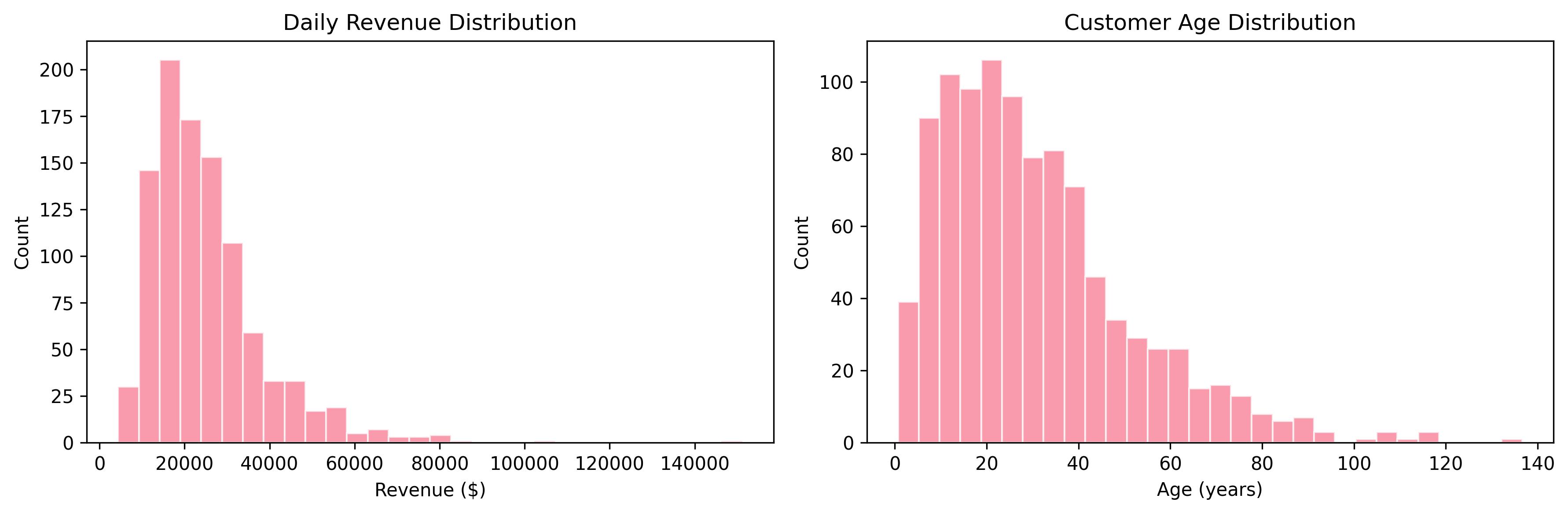 Figure 8: Side-by-side comparison of revenue and customer age distributions using a standardized plotting function for consistent analysis.
Reusable plotting functions also help maintain consistency across projects. Standard labels, palettes, and chart defaults make recurring analysis easier to compare over time and easier to communicate to other people. That consistency becomes increasingly valuable when models are monitored continuously rather than analyzed once.
The Four Pillars of Visualization
One of the fastest ways to choose a chart is to classify the analytical purpose first. In this course, the most useful categories are comparison, relationship, distribution, and composition. Comparison asks how groups differ. Relationship asks how variables move together. Distribution asks what the shape and spread of one variable look like. Composition asks how the parts contribute to the whole.
That classification is especially helpful in machine learning because the same dataset often supports several valid questions. A customer dataset might invite a distribution question about transaction amounts, a relationship question about tenure and churn risk, a comparison question across regions, and a composition question about revenue share by segment. The analytical question determines the chart family, not the other way around.
Click through the four pillars and compare how each analytical question points toward a different chart family.
Distribution Analysis: Understanding Your Variables
Distribution analysis forms the foundation of exploratory visualization. Every variable tells a story through its distribution. Real estate prices may follow a log-normal pattern with a long right tail. Customer transaction amounts may show multiple peaks corresponding to distinct buyer segments. These shapes guide later decisions about transformation, segmentation, and model choice.
The histogram remains the workhorse of distribution analysis. By binning continuous data and displaying frequencies, histograms reveal central tendency, spread, and shape. The choice of bin width affects interpretation. Too few bins obscure detail, while too many create noise. Most plotting libraries provide sensible defaults, but you should still adjust them when your analysis calls for more or less granularity.
import pandas as pd
import matplotlib.pyplot as plt
import seaborn as sns
import numpy as np
# Healthcare example: patient wait times
wait_times = pd.read_csv('emergency_wait_times.csv')
fig, ax = plt.subplots(figsize=(8, 5))
ax.hist(wait_times['minutes'], bins=30, edgecolor='white', alpha=0.7)
ax.set_xlabel('Wait Time (minutes)')
ax.set_ylabel('Frequency')
ax.set_title('Emergency Department Wait Times')
plt.tight_layout()
plt.show()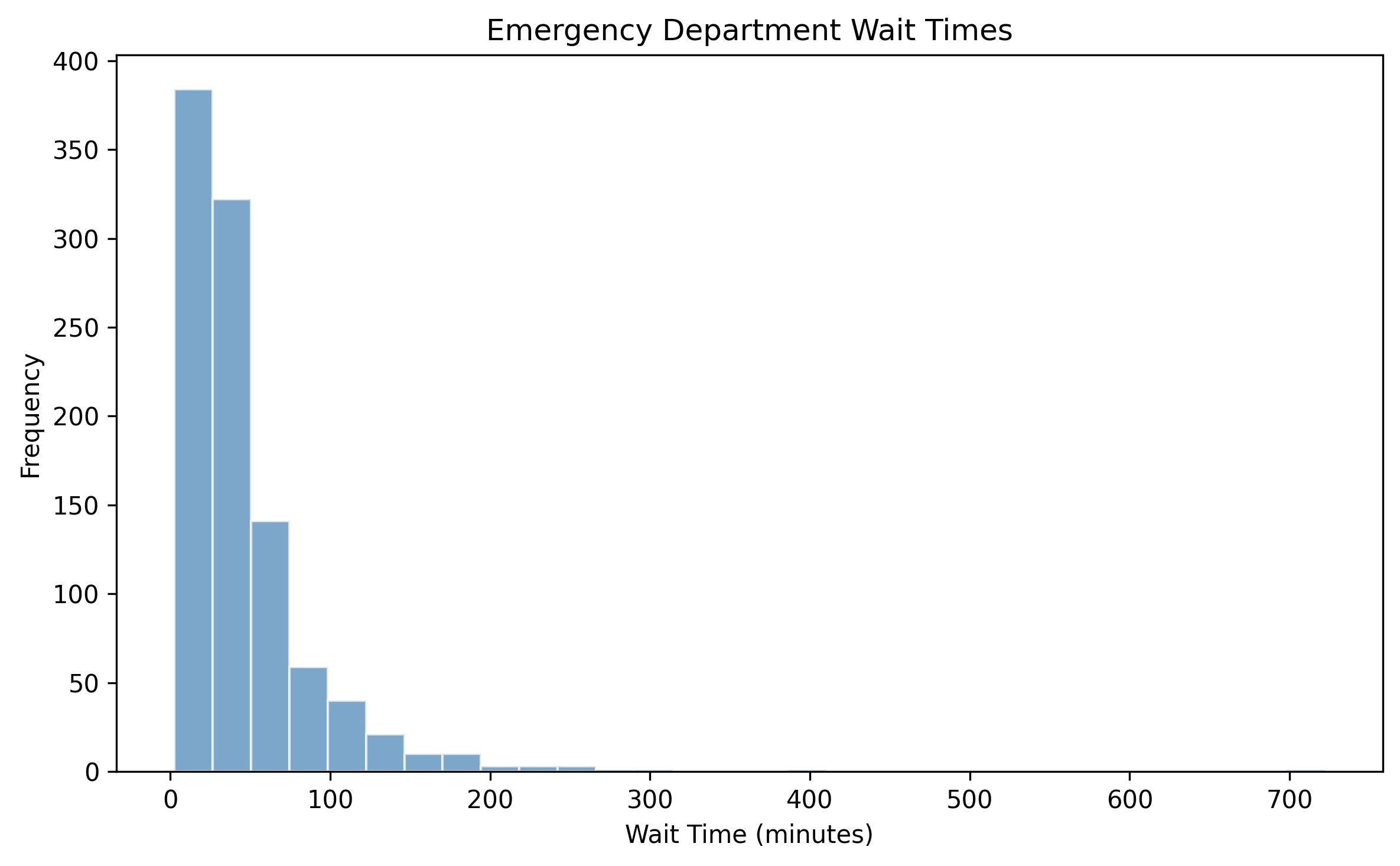 Figure 1: Histogram showing the distribution of emergency department wait times, revealing the typical right-skewed pattern common in healthcare settings.
Kernel density estimation (KDE) provides a smooth alternative to histograms. KDE works especially well when comparing groups because overlapping curves remain readable where multiple histograms would become cluttered. In model preparation, distribution plots also help you decide when a log transform, winsorization step, or robust scaler may be more appropriate than a default preprocessing pipeline.
Example: Loan default rate analysis. A financial analyst examining loan default rates across credit score bands notices the distribution shifts from unimodal for prime borrowers to bimodal for subprime segments. The second peak represents borrowers who default early, suggesting different risk management strategies for each group. This insight, immediately visible in density plots, might take hours to uncover through tabular analysis.
Correlation Patterns: Relationships Between Variables
Correlation analysis reveals how variables move together. While correlation does not imply causation, understanding variable relationships helps with feature selection, multicollinearity checks, and exploratory hypothesis generation. Visualization makes those patterns actionable by revealing non-linear structure, outliers, and clusters that summary statistics alone can miss.
The correlation heatmap transforms a correlation matrix into an intuitive color display. Strong positive correlations appear at one end of the palette, strong negative correlations at the other, and near-zero relationships fade toward the center. That allows you to scan a wide set of features quickly and identify groups that may be redundant or worth combining.
Understanding what the coefficient actually measures still matters. Pearson correlation captures linear association between centered variables, so heavy tails and extreme points can dominate the result. Rank-based alternatives such as Spearman correlation are often more informative when relationships are monotonic but not linear.
r(x,y) = Σ(x_i - x̄)(y_i - ȳ) / √[Σ(x_i - x̄)²] √[Σ(y_i - ȳ)²]
Where: - r(x,y) = Pearson correlation coefficient - x_i, y_i = individual data points - x̄, ȳ = sample means - Σ = sum over all observations - Range: -1 to +1 (perfect negative to perfect positive correlation)
# Real estate correlation analysis
properties = pd.read_csv('property_listings.csv')
numeric_cols = ['price', 'sqft', 'bedrooms', 'bathrooms', 'age', 'lot_size']
correlation_matrix = properties[numeric_cols].corr()
plt.figure(figsize=(10, 8))
sns.heatmap(correlation_matrix, annot=True, cmap='coolwarm', center=0,
square=True, linewidths=1, cbar_kws={"shrink": 0.8})
plt.title('Property Features Correlation Matrix')
plt.show()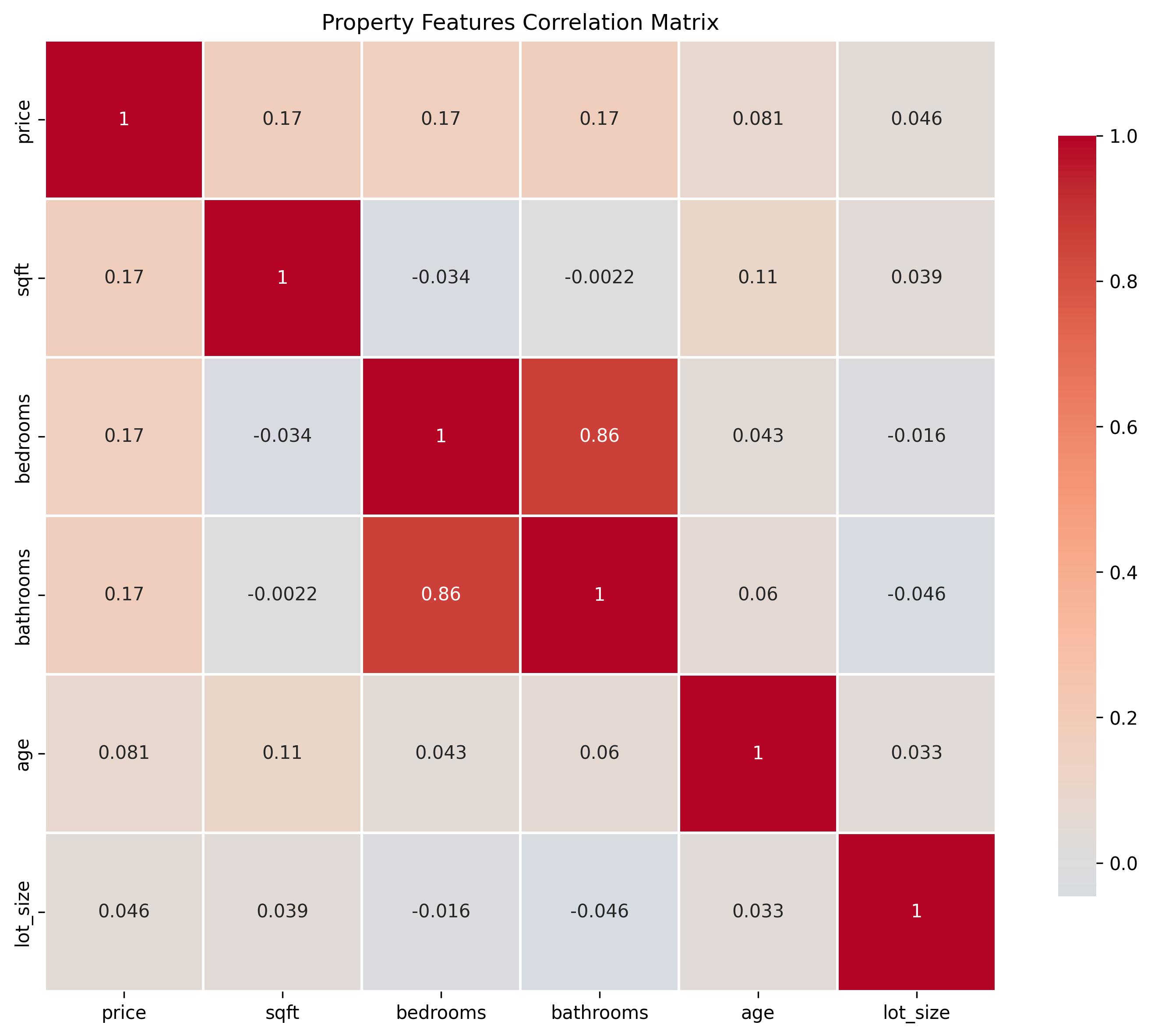 Figure 2: Correlation heatmap showing relationships between property features, with warm colors indicating positive correlations and cool colors indicating negative correlations.
Scatter plots provide the detailed view behind those summaries. Adding regression lines, smoothers, or pair plots makes it easier to detect curvature, clusters, and influential points. In machine learning practice, those relationship visuals often expose when a simple linear feature treatment is too weak for the structure the data is actually showing.
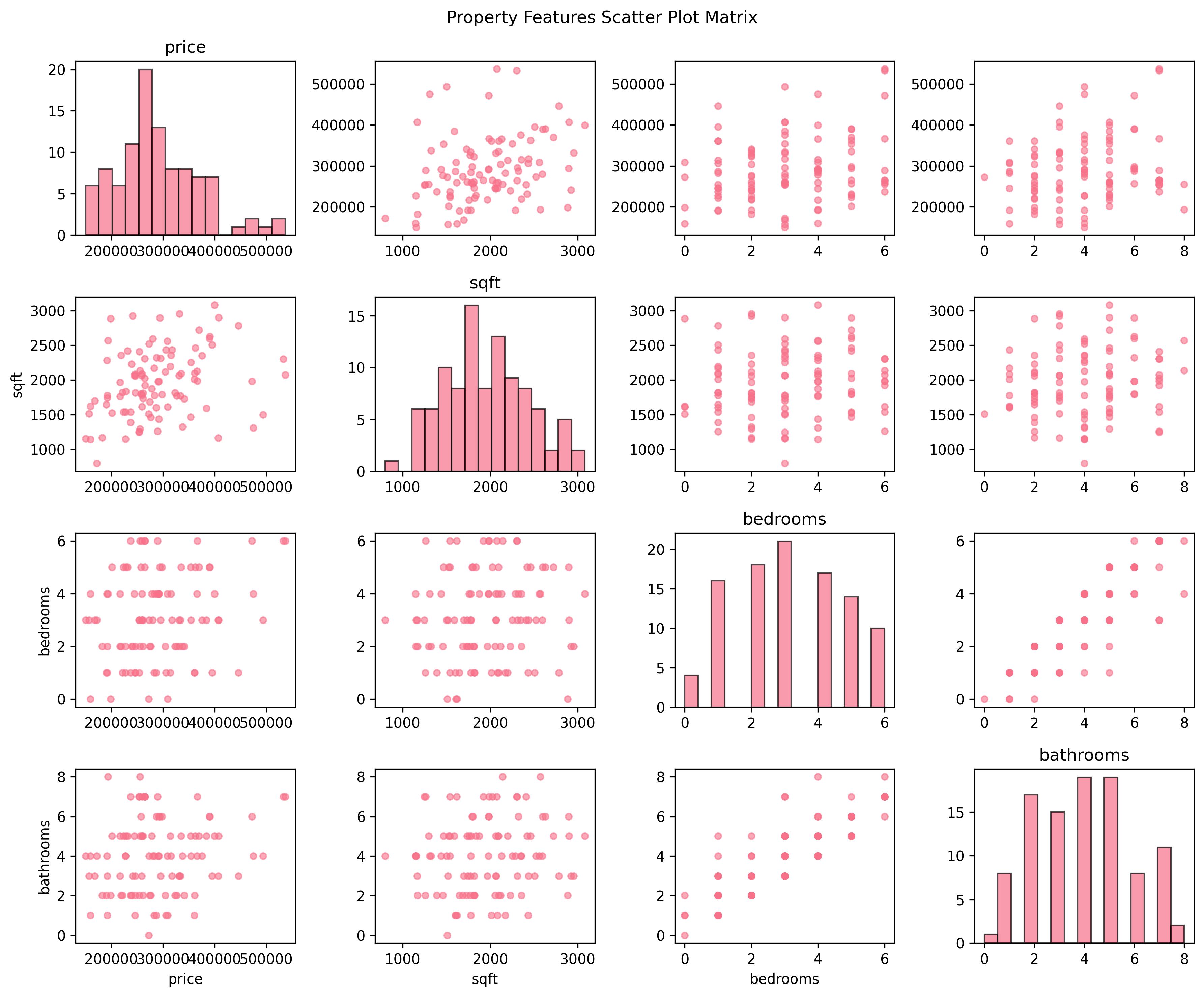 Figure 3: Scatter plot matrix showing pairwise relationships between property features, with histograms on the diagonal and scatter plots in off-diagonal positions.
Time Series Visualization: Temporal Patterns and Trends
Time series data requires visualization approaches that respect ordering and reveal patterns across multiple scales. Financial markets, monitoring systems, and marketing campaigns all generate time-indexed data where sequence matters. Good time series visuals balance local fluctuations with longer trends so you can see both noise and signal.
Line plots form the basis of time series visualization because connected points emphasize continuity. Multiple series on the same axes allow comparison, though scale choice matters if one series could visually dominate the others. Moving averages or rolling windows help reveal trend and seasonality when daily variation would otherwise overwhelm the message.
Example: Marketing campaign analysis. A marketing analyst tracking daily customer acquisition costs across channels notices costs spike every Monday for paid search but remain stable for social media. Overlaying a 7-day moving average confirms the weekly pattern is not random noise but reflects recurring auction dynamics. That temporal pattern directly informs bidding strategy.
Time series charts are also valuable during model evaluation. Forecast errors, prediction drift, changing variance, and delayed regime changes often become obvious on a time-indexed plot before they appear in aggregate metrics. For that reason, time series visualization belongs in both exploratory analysis and post-model monitoring.
# Marketing campaign performance over time
campaign_data = pd.read_csv('daily_conversions.csv', parse_dates=['date'])
campaign_data.set_index('date', inplace=True)
fig, ax = plt.subplots(figsize=(12, 6))
ax.plot(campaign_data.index, campaign_data['conversions'], label='Daily', alpha=0.5)
ax.plot(campaign_data.index, campaign_data['conversions'].rolling(7).mean(),
label='7-day MA', linewidth=2)
ax.plot(campaign_data.index, campaign_data['conversions'].rolling(30).mean(),
label='30-day MA', linewidth=2)
ax.set_xlabel('Date')
ax.set_ylabel('Conversions')
ax.set_title('Campaign Performance with Moving Averages')
ax.legend()
ax.grid(True, alpha=0.3)
plt.show()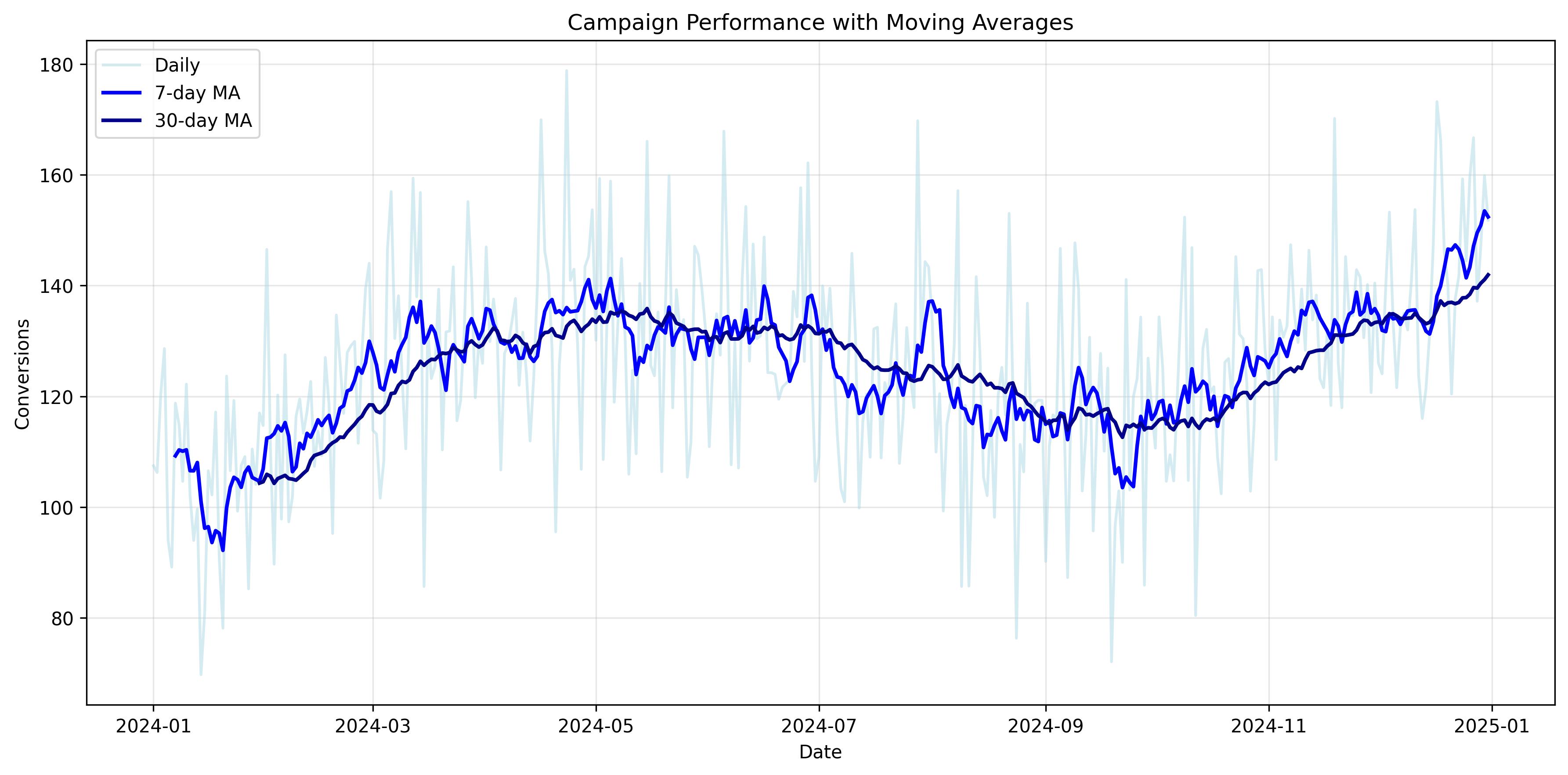 Figure 4: Time series plot showing daily conversion data with 7-day and 30-day moving averages to reveal underlying trends and seasonal patterns.
Categorical Relationships: Comparing Groups
Categorical variables require different strategies than continuous data. Bar charts, grouped bars, box plots, and violin plots reveal differences between groups while respecting the fact that categories are labels rather than numeric positions on a continuum.
Box plots excel at comparing distributions across categories. The five-number summary provides a compact view of center, spread, and outliers. That makes box plots particularly useful when comparing recovery times across treatment groups, revenue across segments, or residual magnitudes across classes in a diagnostic workflow.
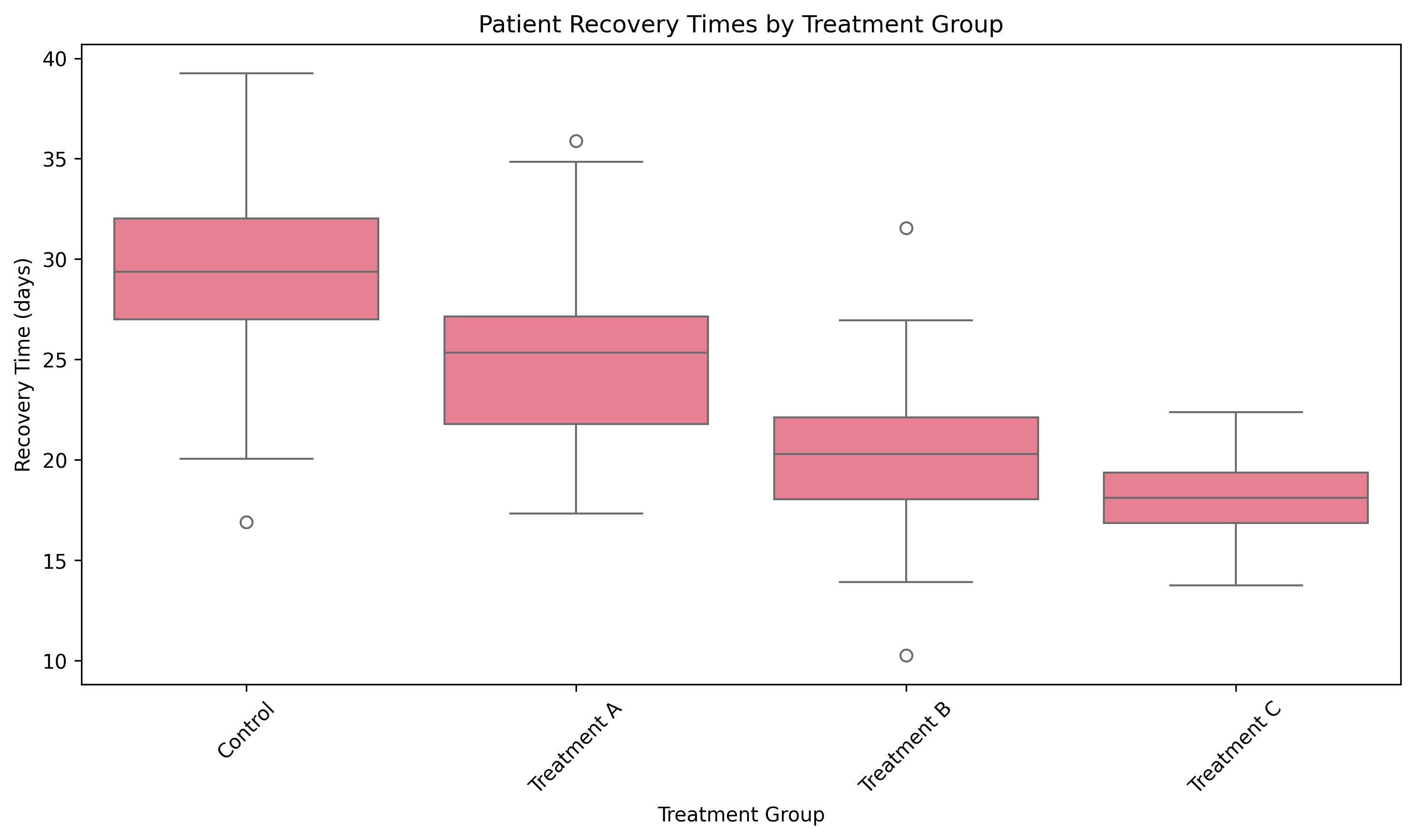 Figure 5: Box plot comparing patient recovery times across different treatment groups, showing median values, quartiles, and outliers for each group.
Violin plots combine box-plot structure with density shape. This is useful when groups differ not only in median or variance but in the actual form of the distribution. A violin plot can reveal bimodality or asymmetry that a box plot compresses away. For exploratory work, that difference can be the clue that a segment contains multiple subpopulations rather than one coherent group.
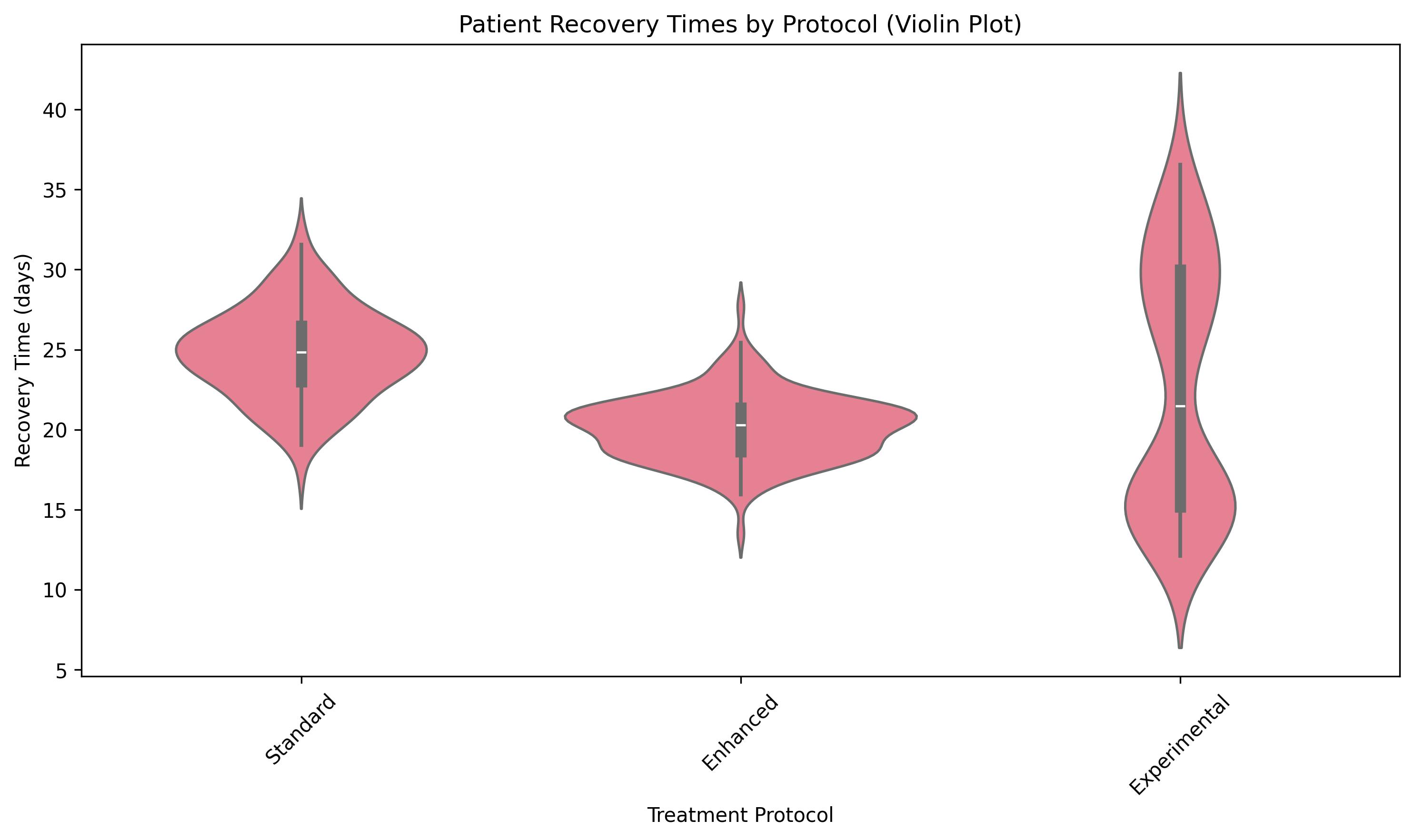 Figure 6: Violin plot showing the full distribution shape of patient recovery times across different treatment protocols, revealing bimodal patterns in the experimental group.
Choosing the Right Visualization for the Analytical Question
Choosing a chart becomes easier when you combine the four pillars with the structure of the data itself. Categories versus values usually call for bars. Time-indexed values usually call for lines. A variable against itself across many bins suggests a histogram. Two numeric variables usually call for a scatter plot. Correlation across many variables is often better seen in a heatmap than in a long table.
Machine learning adds one extra discipline to this decision. Choose only the complexity the question requires. A multivariate visualization can be powerful, but too many encodings at once can turn a chart into a puzzle. Add color, size, faceting, or labels only when each extra dimension answers a question someone genuinely needs answered.
Compare common data structures and use the guide to see which chart families fit best and which ones usually mislead.
Once you know which chart family fits the question, tool choice becomes easier as well. matplotlib offers fine-grained control for publication-quality static figures. seaborn accelerates exploratory analysis with strong defaults for statistical graphics. plotly adds interactivity for dashboards and stakeholder exploration. Many real projects combine them: fast exploration in seaborn, detailed polishing in matplotlib, and interactive delivery in plotly.
import plotly.express as px

# Interactive scatter plot for financial data
stocks = pd.read_csv('stock_fundamentals.csv')
fig = px.scatter(stocks, x='pe_ratio', y='dividend_yield',
                 size='market_cap', color='sector',
                 hover_data=['company', 'price'],
                 title='Stock Fundamentals by Sector')
fig.update_layout(xaxis_title='P/E Ratio',
                  yaxis_title='Dividend Yield (%)')
fig.show()Data Visualization Design Principles
Core Design Principles
Selecting the right chart is only half the task. A good chart with poor design can still confuse the viewer, bury the insight, or exaggerate a pattern that is not really there. Before sharing a visualization, run through a simple checklist: clarity, simplicity, focus, consistency, accuracy, relevance, and context.
Clarity means the chart is understandable within seconds. Labels should be readable, units should be visible, and the title should reflect the point of the chart rather than merely restating the axes. Simplicity means every element earns its place. Decorative fills, redundant legends, or heavy gridlines often consume attention without adding information.
Focus means each chart advances one main message. Consistency means that related charts use a common visual language across a notebook, report, or slide deck. Accuracy means scales, labels, and encodings match the data honestly. Relevance means the design reflects the needs of the audience. Context means the chart includes benchmarks, baselines, or comparison periods when those are necessary to judge significance.
Data-Ink Ratio and Visual Hierarchy
The data-ink ratio is a useful way to think about chart refinement. Every pixel should either show the data or help the viewer interpret it. If a gridline, border, legend, or background effect adds no analytical value, it is competing with the data rather than supporting it.
That does not mean every chart should be stripped to bare bones. It means every design choice should be intentional. A reference line showing a model threshold may be essential. A shaded band showing acceptable error range may improve interpretation. The goal is not minimalism for its own sake. The goal is to reduce friction between the viewer and the insight.
Visual hierarchy guides the viewer to the point that matters most. Use an accent color to highlight the key series or category, and keep supporting elements neutral. Direct labels often outperform distant legends because they reduce eye movement. Strong hierarchy is especially important in model communication, where stakeholders may not have the patience to decode a chart before deciding whether it matters.
Misleading Visuals and Common Chart Mistakes
Many visualization errors are not malicious. They come from defaults, rushed formatting, or a misunderstanding of how human perception works. But the effect is the same: the chart misleads the reader. Truncated axes exaggerate differences in bar charts. Rainbow palettes create noise without hierarchy. Dual axes can suggest relationships that vanish when scales change. Bubble charts can overstate magnitude if area is not scaled correctly.
In ML and analytics settings, these mistakes can be especially costly. A misleading chart can make a weak feature look important, make a small improvement appear dramatic, or make a spurious pattern feel trustworthy. Learning to diagnose these problems is therefore part of analytical literacy, not merely a design preference.
Review the before-and-after examples and notice how small design changes can completely alter the perceived message.
The safest rule is to choose encodings that human perception reads accurately. Position on a common scale is strongest, followed by length. Angle, area, and color intensity are harder to compare precisely. That is one reason bar charts often outperform pies or bubbles when exact comparison matters.
Accessibility and Color Use
Accessible design is part of professional visualization practice. A meaningful share of viewers cannot reliably distinguish red from green, so critical information should never be encoded through color alone. Use redundant cues such as line style, marker shape, direct labels, or position so the message survives even in grayscale.
Color also affects interpretation beyond accessibility. Sequential palettes work well for ordered magnitude. Diverging palettes work well when values split around a meaningful midpoint, such as positive versus negative correlation. Categorical palettes should be used sparingly and consistently. The broader rule is simple: use color to support structure, not to decorate it.
Storytelling with Data
From Exploration to Communication
Exploratory visualization serves the analyst, but presentation graphics serve the audience. During exploration, you generate many plots quickly and discard most of them. During communication, you select the few visuals that carry the argument, refine them carefully, and sequence them so the audience can follow the reasoning without needing to reproduce your full analysis.
That shift matters in machine learning because stakeholders rarely care about every diagnostic you produced. They care about what you found, why it matters, how confident they should be, and what action follows. Effective storytelling turns technical evidence into a clear decision pathway.
Click the framework to explore how context, data, design, and narrative combine to make a visualization persuasive rather than merely accurate.
Audience and Goal
Strong storytelling begins before you format the chart. Ask who will receive it, what they already understand, and what decision they need to make. A technical review for data scientists can tolerate model diagnostics and uncertainty details. An executive briefing usually needs only the central finding, the operational implication, and the associated risk.
Clarifying the goal also helps you decide what to omit. Not every interesting finding belongs in the final presentation. Curating the message is part of analytical judgment, not a loss of rigor. You can preserve the fuller analysis in notebooks or appendices while keeping the main narrative focused on the decision at hand.
Narrative Structure
A useful narrative structure is context, conflict, and resolution. Context frames the problem and explains why the analysis matters. Conflict presents the evidence: the pattern, failure mode, opportunity, or unexpected behavior the data reveals. Resolution explains what should happen next, whether that means changing a threshold, collecting new data, revising a feature set, or deploying a model with specific monitoring controls.
The order of charts should follow the audience’s needs, not the order in which you created them. Start with the broad pattern or key surprise. Then provide just enough supporting evidence to make the interpretation credible. That sequence makes the analysis easier to understand and more persuasive to act on.
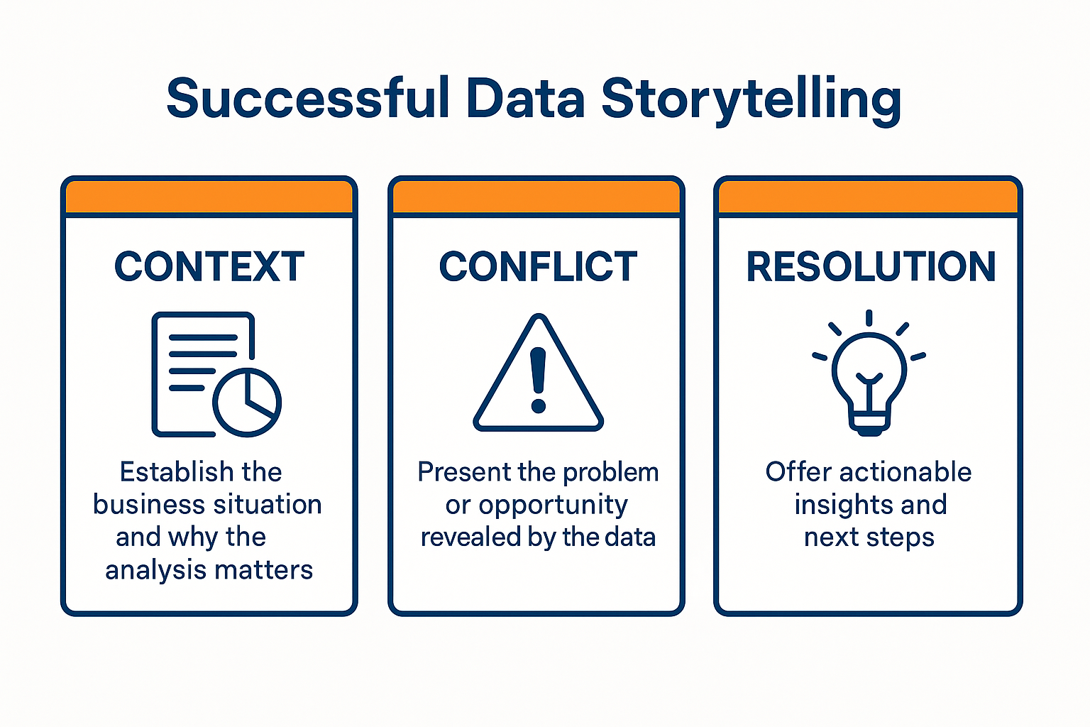 Figure 7: The three-act structure for effective data storytelling, showing how context, conflict, and resolution create compelling business narratives.
Insight-Driven Titles
Many chart titles merely label content: “Feature Importance by Model,” “Monthly Churn Rate,” or “Residuals by Segment.” Those titles tell the audience what they are looking at, but not what they should conclude. An insight-driven title answers the question So what? before the audience has to infer it themselves.
In machine learning contexts, this often means stating the consequence explicitly. “Tree-based models rely heavily on tenure and support tickets” is stronger than “Feature Importance.” “Recall drops sharply for high-value customers” is stronger than “Model Performance by Segment.” The title should focus attention on the point that matters for a decision.
Transform descriptive labels into conclusion-driven titles and notice how quickly the chart becomes easier to interpret.
Call to Action
A strong data story ends with a clear action. In machine learning work, that action may be operational rather than purely managerial. You might recommend retraining the model on a fresher sample, segmenting the population before modeling, adding fairness checks, investigating a drift signal, or lowering deployment confidence until more validation data is collected.
Specificity is what turns a recommendation into a useful one. “Improve the model” is vague. “Collect more failure cases from the underrepresented segment and retrain before rollout” is actionable. The audience should leave knowing not only what the evidence says, but also what to do next.
References
Tufte, E. R. (2001). The visual display of quantitative information (2nd ed.). Graphics Press. https://www.edwardtufte.com/tufte/books_vdqi
Few, S. (2009). Now you see it: Simple techniques of quantitative analysis. Analytics Press.
Cairo, A. (2019). How charts lie: Getting smarter about visual information. W.W. Norton & Company.
Knaflic, C. N. (2015). Storytelling with data: A data visualization guide for business professionals. Wiley.
Wickham, H. (2016). ggplot2: Elegant graphics for data analysis (2nd ed.). Springer. https://ggplot2-book.org/
Wilke, C. O. (2019). Fundamentals of data visualization. O’Reilly Media. https://clauswilke.com/dataviz/
Munzner, T. (2014). Visualization analysis and design. CRC Press. https://www.cs.ubc.ca/~tmm/vadbook/
Plotly. (2024). Plotly Python graphing library. https://plotly.com/python/
© 2026 Prof. Tim Frenzel. All rights reserved. | Version 1.1.0