Section 3: Descriptive Statistics in Excel
Measures of Central Tendency
The central tendency of a dataset tells us where most values cluster, providing a single number that represents the typical observation. Three measures dominate business analysis: mean, median, and mode, each revealing different aspects of data behavior. Excel implements these through straightforward functions, but choosing the right measure requires understanding their mathematical properties and business implications.
The arithmetic mean, calculated as the sum of all values divided by the count, remains the most common measure due to its mathematical simplicity. Excel’s AVERAGE function computes this directly: =AVERAGE(A2:A100). The mean uses every data point, making it sensitive to extreme values that may distort the representation of typical cases. For normally distributed data without outliers, the mean provides the best estimate of central location.
The median splits data into equal halves, with 50% of observations falling above and 50% below. This positional measure ignores actual values beyond their rank order, providing robustness against outliers that plague the mean. Excel’s MEDIAN function sorts data internally before selecting the middle value (or averaging the two middle values for even-count datasets). When data contains extreme values or skewed distributions, the median often better represents the typical case.
A real estate analyst examining home prices in a neighborhood finds 45 properties with prices ranging from $180,000 to $420,000, except for one mansion listed at $3.2 million. The mean price calculates to $341,333, suggesting homes typically cost over $340,000. The median of $265,000 tells a different story: half the homes cost less than $265,000, providing a more realistic expectation for typical buyers. The outlier mansion shifts the mean by over $70,000 but leaves the median unchanged.
The mode identifies the most frequent value, particularly useful for categorical data where mean and median lack meaning. Excel’s MODE.SNGL function returns the most common value, while MODE.MULT (available through array formulas) identifies multiple modes when they exist. For continuous data, the mode may not exist or may represent measurement artifacts rather than meaningful patterns.
Which measure should drive business decisions? The answer depends on the decision context and data characteristics. Symmetric distributions with few outliers favor the mean for its mathematical properties. Skewed distributions or those with outliers favor the median for its resistance to extreme values. Categorical variables require the mode, as arithmetic operations lack meaning for non-numeric categories.
Variability and Distribution Analysis
Variability quantifies spread around central tendency, revealing whether data points cluster tightly or scatter widely. Two datasets with identical means can exhibit vastly different risk profiles, making variability measurement fundamental to business decision-making. Excel provides multiple dispersion measures, each capturing different aspects of data spread.
The range, calculated as maximum minus minimum, provides the simplest spread measure. Excel computes this as =MAX(range)-MIN(range). While intuitive, the range depends entirely on two extreme points, ignoring the distribution of values between them. A single outlier can inflate the range significantly, making it unstable for comparative analysis.
Standard deviation measures average distance from the mean, providing a mathematically reliable spread measure that uses all data points.
σ = √(Σ(xi - μ)²/N)
Where: - σ = population standard deviation - xi = each individual value - μ = population mean - N = total number of observations - Σ = sum over all observations
Excel distinguishes between population (STDEV.P) and sample (STDEV.S) calculations, with the sample version dividing by N-1 to correct for bias when estimating population parameters from samples.
Variance, the squared standard deviation, appears frequently in statistical formulas but lacks intuitive interpretation due to squared units. Excel’s VAR.P and VAR.S functions calculate population and sample variance respectively. The relationship between standard deviation and variance (σ² = variance) allows conversion between measures as analytical needs require.
The coefficient of variation (CV) standardizes variability relative to the mean.
CV = σ/μ
Where: - CV = coefficient of variation (unitless ratio) - σ = standard deviation - μ = mean
This unitless ratio enables comparison across datasets with different units or scales. A manufacturing process with 2mm standard deviation and 100mm mean (CV = 0.02) exhibits less relative variability than one with 1mm standard deviation and 10mm mean (CV = 0.10), despite the smaller absolute deviation.
| Statistic | Formula | Excel Function | Interpretation | Use Case |
|---|---|---|---|---|
| Range | Max - Min | =MAX()-MIN() | Total spread | Quick assessment |
| Standard Deviation | √(Σ(x-μ)²/N) | STDEV.S() or STDEV.P() | Average deviation | Risk analysis |
| Variance | Σ(x-μ)²/N | VAR.S() or VAR.P() | Squared deviation | Statistical modeling |
| Coefficient of Variation | σ/μ | =STDEV()/AVERAGE() | Relative variability | Cross-dataset comparison |
Distribution shape adds to central tendency and spread measures. Skewness quantifies asymmetry around the mean, with positive skew indicating a right tail (common in income data) and negative skew indicating a left tail (common in test scores with ceiling effects). Excel’s SKEW function calculates sample skewness, with values beyond ±1 suggesting substantial asymmetry.
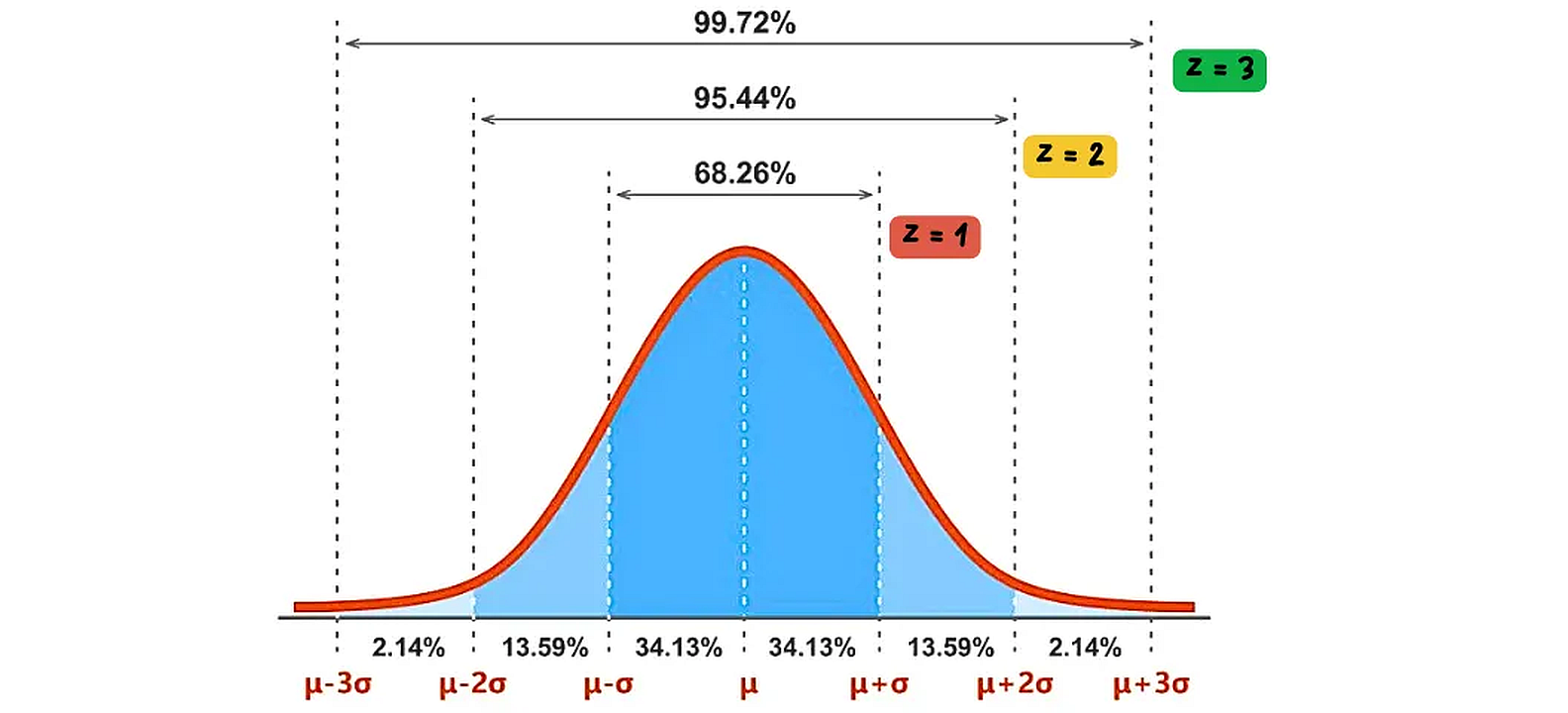
The normal distribution, often called the bell curve, is a symmetric probability distribution where most observations cluster around the central peak, and the probabilities for values further away from the mean taper off equally in both directions. Z-scores standardize individual data points by expressing them as the number of standard deviations they are from the mean. A Z-score of 0 means the data point is at the mean, a Z-score of 1 means it’s one standard deviation above the mean, and so on. This standardization allows for comparison of data from different normal distributions.
Kurtosis measures tail thickness relative to a normal distribution. Excel’s KURT function returns excess kurtosis, where positive values indicate heavy tails (more extreme values than normal) and negative values indicate light tails. Financial returns often exhibit positive kurtosis, reflecting occasional extreme movements that normal distributions underestimate.
Percentiles divide data into hundredths, with each percentile representing the value below which that percentage of observations fall. Excel’s PERCENTILE.INC and PERCENTILE.EXC functions differ in their treatment of boundaries, with INC including the full range [0,1] and EXC excluding endpoints. The interquartile range (IQR = Q3 - Q1) provides a robust spread measure using the 25th and 75th percentiles: =QUARTILE.INC(range,3)-QUARTILE.INC(range,1).
Correlation Analysis
Correlation measures linear relationships between variables, revealing how changes in one variable associate with changes in another. The Pearson correlation coefficient, ranging from -1 to +1, measures both strength and direction of linear associations. Excel’s CORREL function computes this directly, but understanding what correlation reveals and conceals guides appropriate interpretation.
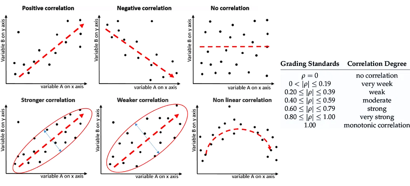
Correlation can be positive (variables move in the same direction), negative (variables move in opposite directions), or non-existent. The strength of a linear correlation is measured by the correlation coefficient (r or ρ), which ranges from -1 to +1. A value close to ±1 indicates a strong linear relationship, while a value close to 0 indicates a weak or no linear relationship. Non-linear correlations exist when variables have a clear relationship that does not follow a straight line.
The correlation formula standardizes covariance by the product of standard deviations.
r = Σ[(xi - x̄)(yi - ȳ)] / √[Σ(xi - x̄)² × Σ(yi - ȳ)²]
Where: - r = Pearson correlation coefficient (-1 to +1) - xi = individual values of variable X - x̄ = mean of variable X - yi = individual values of variable Y - ȳ = mean of variable Y - Σ = sum over all observations
This standardization produces a scale-free measure where ±1 indicates perfect linear relationships, 0 indicates no linear relationship, and intermediate values indicate partial associations. The squared correlation (r²) represents the proportion of variance in one variable explained by the other.
When does correlation mislead? Non-linear relationships can exhibit zero correlation despite strong associations. Variables with a U-shaped relationship might show r ≈ 0 even though knowing one perfectly predicts the other. Correlation also requires sufficient variability in both variables; restricted ranges attenuate correlations that would appear stronger across the full range.
Excel’s Data Analysis ToolPak generates correlation matrices for multiple variables simultaneously. After enabling the ToolPak (File > Options > Add-ins), selecting Data > Data Analysis > Correlation produces a matrix showing all pairwise correlations. This matrix reveals variable clusters and multicollinearity patterns that affect subsequent modeling.
The interpretation problem lies in distinguishing correlation from causation. Two variables may correlate strongly due to common causes, reverse causation, or coincidence. Ice cream sales correlate with drowning deaths not because ice cream causes drowning, but because both increase during summer months. Business analysts must consider logical mechanisms and temporal sequences before inferring causal relationships from correlations.
Correlation assumes linear relationships between continuous variables. For ranked data, Spearman’s rank correlation (available through the RANK and CORREL functions combined) provides a non-parametric alternative. For categorical variables, other association measures like chi-square tests move beyond Excel’s built-in functions, though pivot tables can reveal patterns through cross-tabulation.
Statistical significance of correlations depends on sample size. A correlation of 0.3 might be statistically significant with 100 observations but not with 20. The approximate standard error provides a rough significance test.
References
Microsoft. (2024). Statistical functions reference. Microsoft Support. https://support.microsoft.com/en-us/office/statistical-functions-reference-624dac86-a375-4435-bc25-76d659719ffd
Levine, D. M., Stephan, D. F., & Szabat, K. A. (2021). Statistics for managers using Microsoft Excel (9th ed.). Pearson. https://www.pearson.com/en-us/subject-catalog/p/statistics-for-managers-using-microsoft-excel/P200000003030
Real Statistics Using Excel. (2024). Descriptive statistics. Real Statistics. https://real-statistics.com/descriptive-statistics/
© 2025 Prof. Tim Frenzel. All rights reserved. | Version 1.0.5